Graphic design

Freelance graphic desing projects

The project
This page contains a selection of the projects I did while freelancing as a graphic designer.
Client
Miscellaneous
Responsebilities
Graphic design
Tools
1
Logo design
Suus de Wit museumeducatie
Suus de Wit is freelance museum guide working primarily at the Rijksmuseum and Anne Frank Museum in Amsterdam. She educates both kids and adults who participate in guided tours at the museums.

Suus de Wit hired me to design a logo for her business to be applied on business cards, invoices and social media etc. The logo needed to convey a professional feeling without it being too old-fashioned.

I designed a logo that has a fresh and minimal aesthetic and a professional feeling. As a reference I made the frame in the logo the same ratio as one of Suus' favorite paintings: "The Jewish Bride" by Rembrandt.
2
Illustration
IMOGAY
Derived from the phrase 'I'm okay', IMOGAY is a clothing brand focused on sending a positive image towards and about the LGBTQ+ community.

IMAGOY asked my to create a design that could be printed on their t-shirts and sweaters. I got a lot of freedom for this project, the only condition was that the design would fit into their streetwear inspired style.

My design is based around the '='-symbol. A symbol that stands for equality. I illustrated a portrait of an androgynous person and made the overall aesthetics remind you of street art.
3
Logo design
Inclusief Exclusief
Inclusief Exclusief is a network event which connects employers who want to learn more about a more diverse work environment, and young professionals with a work challenge.

To give the event a face they hired me to design their logo. Without having obvious references to race, gender or sexuality the logo should represent diversity and exclusivity.

I designed the logo to be two hands shaking, as a symbol of a deal being made. The mosaic pattern in the hands represent the diversity in background of the target audience.
4
Poster design
Icon design
Ik hou van Lotharius
For a block party in the Lothariuslaan in my hometown I was asked to design a poster and a Facebook banner. The theme of the event would be The Netherlands. The name refers to the dutch themed games how Ik hou van Holland (I love Holland).

After looking for inspiration I decided on a block themed poster. Not only because it is a pun, but also because it would be easily re-sizable into a Facebook banner. I started with designing two rough ideas for the posters to make sure I got the information architecture right. After I settled on a color scheme and typography I designed the icons I wanted to incorporate into the designs.
5
Invitation design
Information architecture
Illustration
Wedding invitations
For the special day of Charles and Alexandra I designed wedding invitations.

She was born in Paris and he was born in London, and lived in Hong Kong and Dubai as a couple. They wanted to reflect this, alongside with their love of nature, on the invitation. Because her family barely speaks English and his family doesn't speak French the invitation had to contain two languages. The couple had sent me a lot of inspiration and a color scheme I could work with.

During this project I encountered a number of challenges. Incorporating the various contrasting themes in the design, while using the set color scheme was a big one. But I am most proud of my solution for the two languages displayed on the invitations.
6
Landing page
Copywriting
Babel - my first landing page
Babel is a language institute that offers courses for individuals and businesses and other organizations.

For a new course they hired me to design the landing page, that would be linked to an online advertising campaign. I had not yet designed an online product before but I decided to take on the challenge.

For this project I researched well conversing landing pages and their anatomy. I mirrored the layout and designed a page accordingly in the style of Babel. The copy of the page was not pre-defined. Babel sent me a lot of copy and photo's I could use and I rewrote it into a commercial text.
7
Logo design
Blauwwwdruk
For the creative front-end development agency Blauwwwdruk I designed a lettermark.

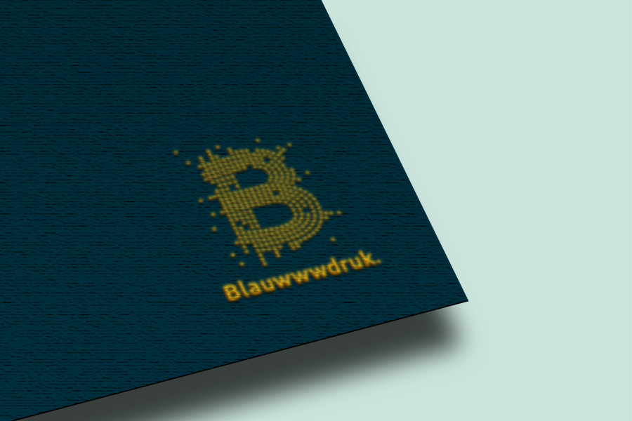
Blauwwdruk wanted the logo to convey a strong and explosive personality while it made clear that it was a tech company. Blauwwwdruk had already provided a typeface and color scheme for me to work with.

I decide to take the requested explosive personality literally and made a logo made out of dots (or points or pixels) that could be animated into an exploding version, reminiscent of fireworks.
If you want to tell me what you thing of my projects, or want to tell me anything else, don't hesitate to send me a message!

View next project

Fly UX - Desiging an airline app from scratch

View next project