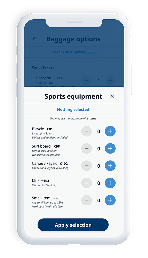
Unexpected total price
While conducting research I realized a recurring reason for dissatisfaction within or after the booking process is the fact that users are surprised about the total amount that they have to pay. To make sure there are no surprises, I have designed a sub header which shows the total amount the user would have to pay for their selection so far. As the user selects more or more expensive options, the amount changes accordingly.


.svg)

.png)